
new layout! feedback?
8 posts • Page 1 of 1
new layout! feedback?
![]() by teendown » Tue Nov 03, 2009 8:20 pm
by teendown » Tue Nov 03, 2009 8:20 pm
i have another new layout that i need help on haha (:
i like it, but feel that it needs a little something extra, i just don't know what!
any and all feedback is greatly appreciated! (:
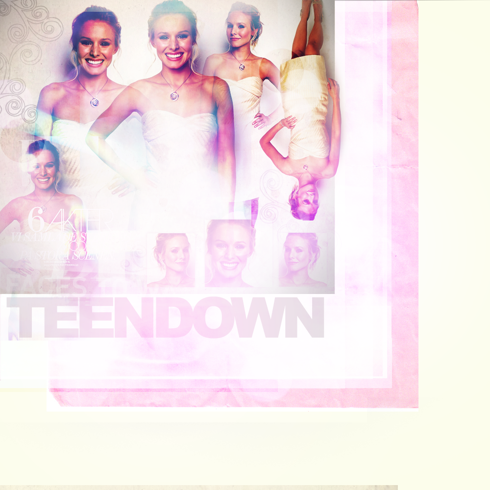
here it is::
http://i679.photobucket.com/albums/vv15 ... ayout7.png
i like it, but feel that it needs a little something extra, i just don't know what!
any and all feedback is greatly appreciated! (:
here it is::
http://i679.photobucket.com/albums/vv15 ... ayout7.png
http://teendown.com
i'm alyssa; talk to me (:
i'm alyssa; talk to me (:
-

teendown - Newbie
- Posts: 23
Re: new layout! feedback?
![]() by olivia » Wed Nov 04, 2009 7:31 am
by olivia » Wed Nov 04, 2009 7:31 am
It's a little too bright and using celebrity photos is a little 1999.
-

olivia - Administrator
- Posts: 521
- Location: USA
Re: new layout! feedback?
![]() by MiaWithLove » Wed Nov 04, 2009 10:49 am
by MiaWithLove » Wed Nov 04, 2009 10:49 am
I agree with Olivia, you should darken it up a little! It's also a little bit too tall, you should not have to scroll down to far to see the content on any website. But I like the textures and brushes you used, the images also seem fun and bouncy! I like were you're going with it ^__^

-

MiaWithLove - Regular
- Posts: 83
- Location: Florida U S of A
Re: new layout! feedback?
![]() by teendown » Wed Nov 04, 2009 5:12 pm
by teendown » Wed Nov 04, 2009 5:12 pm
okay, complete redo (:
im not finished, but i dont even know if i should continue in this direction
help?
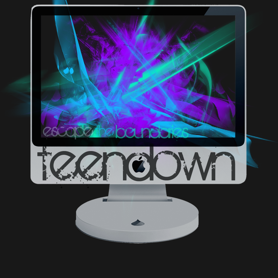
here it is::
http://i679.photobucket.com/albums/vv15 ... ayout8.png
im not finished, but i dont even know if i should continue in this direction
help?
here it is::
http://i679.photobucket.com/albums/vv15 ... ayout8.png
http://teendown.com
i'm alyssa; talk to me (:
i'm alyssa; talk to me (:
-
teendown - Newbie
- Posts: 23
Re: new layout! feedback?
![]() by VisualRevel » Wed Nov 04, 2009 5:19 pm
by VisualRevel » Wed Nov 04, 2009 5:19 pm
It's really bright and i don't really like when people use hollywood photography when it isn't their own.
For the mac one, it's confusing as to why it's on a mac screen...
Just darken it and use drawings instead.
For the mac one, it's confusing as to why it's on a mac screen...
Just darken it and use drawings instead.

-

VisualRevel - Newbie
- Posts: 13
Re: new layout! feedback?
![]() by teendown » Wed Nov 04, 2009 8:09 pm
by teendown » Wed Nov 04, 2009 8:09 pm
VisualRevel wrote:It's really bright and i don't really like when people use hollywood photography when it isn't their own.
For the mac one, it's confusing as to why it's on a mac screen...
Just darken it and use drawings instead.
okay thanks (:
and the reason i used a mac screen was because i was trying to say that in graphic design you're limited to what your computer can do, but we need to "escape the boundaries" and go beyond that (:
http://teendown.com
i'm alyssa; talk to me (:
i'm alyssa; talk to me (:
-
teendown - Newbie
- Posts: 23
Re: new layout! feedback?
![]() by teendown » Wed Nov 04, 2009 11:15 pm
by teendown » Wed Nov 04, 2009 11:15 pm
okay, i went back to the original and attempted to make it higher and darken it . . .
what do you think of it now?
here it is::
http://i679.photobucket.com/albums/vv15 ... out7-1.png
what do you think of it now?
here it is::
http://i679.photobucket.com/albums/vv15 ... out7-1.png
http://teendown.com
i'm alyssa; talk to me (:
i'm alyssa; talk to me (:
-
teendown - Newbie
- Posts: 23
Re: new layout! feedback?
![]() by RiceAddikt » Thu Nov 05, 2009 2:38 am
by RiceAddikt » Thu Nov 05, 2009 2:38 am
The colors and textures are nice and it looks much better darker, but a few things:
1. Random bright tealish glow streak or whatever looks awkward. Also, the brush does too - lower opacity or try a different one.
2. Have center Kristen be main focus in that you can't see the arms of the other ones; it'll look much better that way.
3. Having the pink suddenly cut off midway is a little weird, so figure out what you want to do there.
4. I too agree that using celeb photos is not exactly the richest choice, but it's not a bad layout.
-

RiceAddikt - Newbie
- Posts: 5
8 posts • Page 1 of 1
Who is online
Users browsing this forum: No registered users and 17 guests